maximum time to publish the first offer after sign-up instead of several hours
Back to selected projects
Shar App
Creator economy / Ad platform
A barter advertising platform designed to get both sides to value faster.
I worked on product structure, UX design, and onboarding logic to make it easier for companies and bloggers to understand the process, publish offers faster, and need less manual support.

support requests after simplifying the path to first value, down from about twenty a day
01
Overview
A platform designed to reduce friction in a two-sided advertising workflow.
Shar App was built to help companies order barter advertising from bloggers through a structured platform instead of scattered chats, manual spreadsheets, and support-heavy coordination.
Product
A platform where companies publish offers and bloggers choose suitable barter placements through a clearer, more guided workflow.
Main task
Make the path from sign-up to first published offer much shorter and reduce the amount of support needed to explain how the system works.
User mission
Help both sides understand the process quickly, act with more confidence, and reach the first successful collaboration with less back-and-forth.
Product success
Faster activation, lower support load, and a clearer path to first value inside a two-sided product system.
02
Why this problem mattered
Marketplace products fail early when users cannot quickly understand how both sides are supposed to move.
Product problem
The platform had to coordinate two different user groups with different goals, expectations, and actions. If the structure felt unclear, activation slowed down and support had to fill the gaps manually.
User problem
Companies needed to publish offers without spending hours figuring out the logic. Bloggers needed to understand what was available, what was expected, and how to move through the platform without confusion.
Where it breaks
- Two-sided logic is hard to explain in one clean entry flow
- Users hesitate when they do not see the next step clearly
- Support load grows when the platform cannot teach itself
- First value comes too late if publishing feels operationally heavy
Before the platform could scale its activity, it first had to reduce how much interpretation it asked from new users.
03
Discovery and framing
The core question was where the product was creating preventable friction instead of momentum.
I focused on the first-value journey: sign-up, onboarding, offer creation, understanding platform logic, and the points where users had to stop and ask for help.
Activation timing and support volume showed that the path to first action was too slow and too dependent on manual explanation.
Regular conversations with users and platform feedback helped reveal where companies and bloggers interpreted the process differently.
Flow restructuring and onboarding refinements were used to test whether the product could become clearer without increasing complexity.
Mapped the two-sided journey around first value
I broke the system down into the moments where companies and bloggers needed different explanations, actions, and expectations.
Reduced operational friction in offer publishing
The path to first published offer was too slow, so I focused on reducing the number of unclear steps and making the logic more explicit.
Clarified onboarding for both user groups
The platform needed to explain itself differently depending on who entered it, so the onboarding had to feel more tailored and less generic.
Used support pain points as product signals
Instead of treating support requests as isolated issues, I treated them as evidence that the product structure was not carrying enough explanatory load on its own.
Marketplace logic flow
Sign up
understand who you are in the system
Set up
complete only the information needed to move forward
Publish or choose
reach the first meaningful action with less hesitation
Collaborate
keep the process readable after activation
04
Key decisions
The work was less about decorating a marketplace and more about making its logic easier to enter and trust.
Reduced the path to first published offer
I focused on turning a long, support-heavy sequence into a clearer progression that helped companies publish faster and with less uncertainty.
Separated explanations for different user roles
A shared marketplace still needed different logic for companies and bloggers, so the product had to become clearer about what each side should do next.
Treated support questions as product structure failures
Lowering support load depended on the product teaching itself better, not on writing more one-off explanations outside the interface.
05
Final direction
The final direction focused on reducing ambiguity at the first moments of use and keeping the platform readable after activation.
The design work concentrated on the moments where structure mattered most: onboarding, first publishing, offer discovery, and the parts of the system where users had to understand what the platform expected from them.
The screens below show how the platform helped users orient themselves faster: from discovering relevant offers to understanding activity and progress inside the system.
Map, offers, and profile states presented as one readable mobile flow
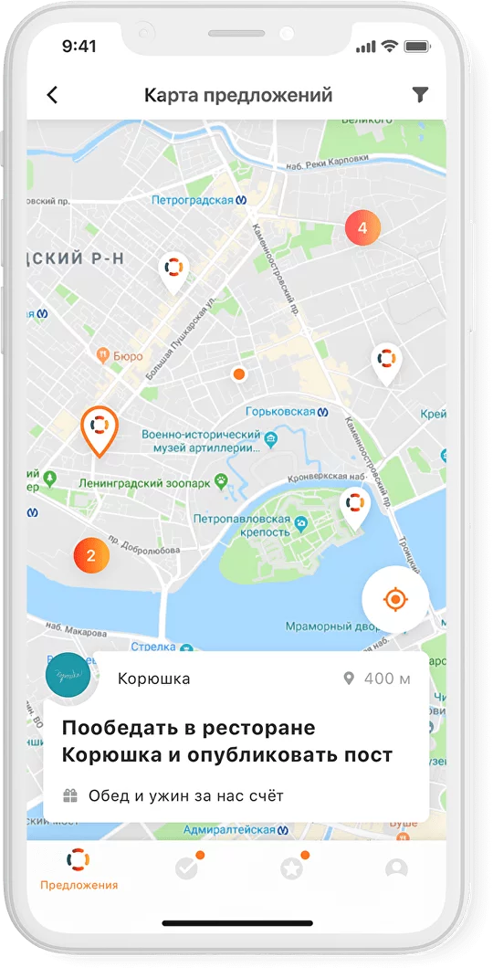


Together these screens show a calmer mobile structure for the core flow: discover nearby opportunities on the map, switch to a clearer list when needed, and read activity and trust signals inside the profile layer without losing orientation in the system.
Onboarding logic
Identify role
clarify whether the user enters as company or blogger
Reduce setup load
ask only for the information needed to move forward
Reveal next step
make the first meaningful action obvious
Maintain momentum
keep users moving without waiting for support
06
Role and scope
The product needed clearer structure, clearer expectations, and less dependence on human explanation.
My role
I worked on UX design, platform structure, onboarding logic, and the way core workflows were framed for different user groups.
What I focused on
Flow clarity, first-value speed, role-based logic, support-reducing structure, and mobile adaptation where it mattered to activation.
Key constraints
The product had to serve two sides of a marketplace while still feeling clear enough to self-explain. If either side stalled early, the system lost momentum quickly.
Why this was difficult
Solving clarity for one audience was not enough. The structure had to reduce friction for both companies and bloggers without making the product feel over-scripted or rigid.
Results and what
this case demonstrates.
The outcome was not only a cleaner workflow, but a product that relied less on manual explanation and reached first value faster for both sides of the marketplace.
Support requests dropped from around twenty a day to roughly five to ten a month after the product became easier to understand and move through.
The maximum time to publish the first offer after sign-up dropped from several hours to around eighteen minutes.
The result was a platform that asked for less interpretation before asking people to act.
In products like this, clarity is not only about cleaner screens. It is what allows a two-sided system to move without constant manual support.


